Password Required
Need access? Get in touch.
The Background

This case study picks up where the PLCB LOOP redesign left off. After the successful launch of the new LOOP platform, the Pennsylvania Liquor Control Board came back to us with a follow-on project: a major update to their store pickup fulfillment application, the Associate Portal.
The Associate Portal is the internal web application used by PLCB store associates to assemble pickup orders. When a licensee or regular consumer orders online for store pickup, an associate receives that order in the portal and physically collects each item from the store shelves – a process called "picking". The collected items are then staged in the store to be give to the customer or licensee when they arrive during their scheduled pickup window.
This picking process was almost entirely manual. Associates tracked orders on printouts, checking items off by hand. This produced a lot of errors and made auditing past orders very difficult.
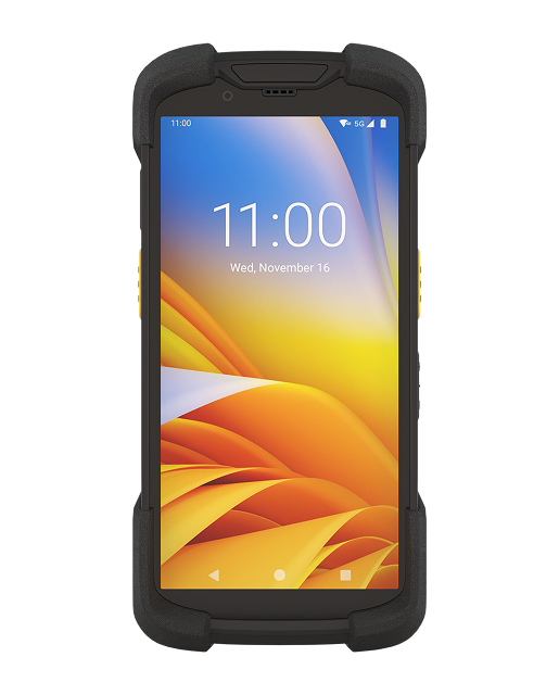
The Zebra barcode scanner used by store associates
The Challenge
The goal was to replace the pen-and-paper picking process with a digital, barcode-scanning workflow. Associates would use Zebra barcode scanners (Android-based devices with dedicated barcode scanners built in) to scan each item as they pulled it from the shelf. The system would verify the item against the order, flag discrepancies in real time, and provide auditory feedback for successful and unsuccessful scans.
Designing this well meant thinking through every edge case. What happens when a barcode doesn't scan? When a scanned item isn't on the order? When an item has reached its maximum scan count? When the device fails mid-pick?
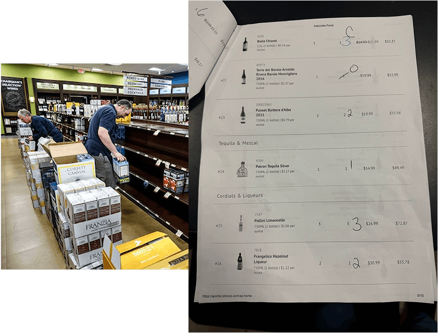
Research artifacts from the observational study – documenting the existing pen-and-paper picking process before designing the digital replacement
Research in the Field
My team and I conducted an observational study at a PLCB store. We followed associates through the picking process – watching how they moved around the store, referenced their paper order sheets, and marked discrepancies as they arose.
The paper-based process was slow and error-prone. Associates had to hold a printout while moving through tight aisles, cross-referencing product names and SKUs manually.
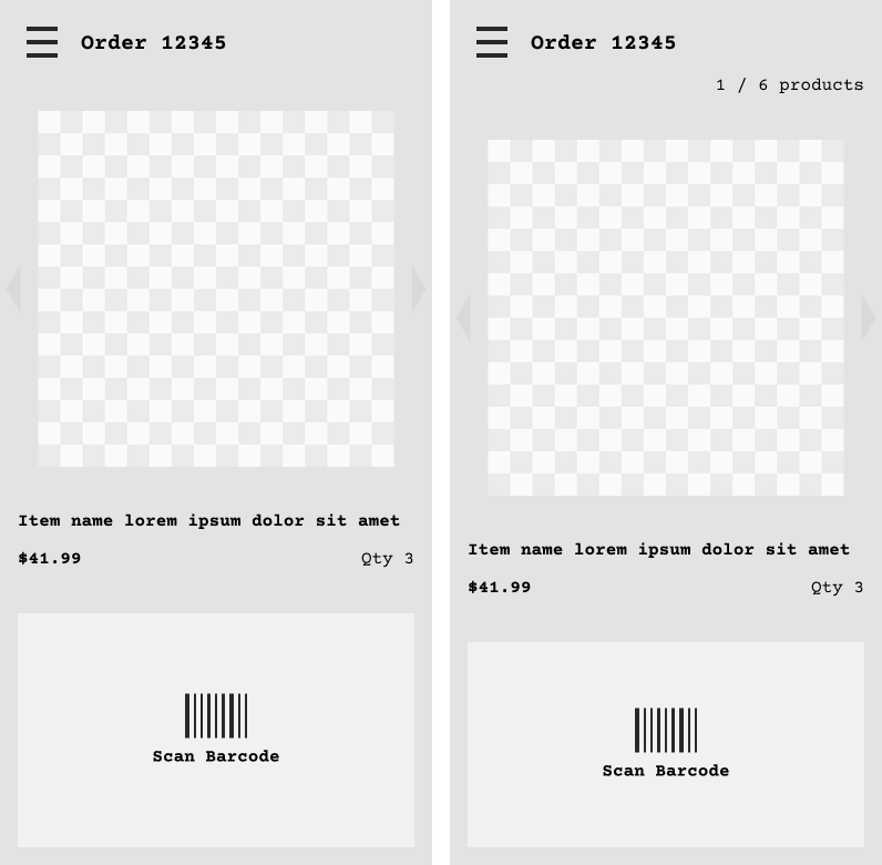
Wireframes for the scanning flow – paired with functional specifications describing every interaction state and edge case.
Design & Prototyping
We then moved into wireframing and rapid prototyping in Figma. Given that the scanning interaction was the core of the experience, we built interactive prototypes early – giving the client something tangible to react to.
The prototypes were designed specifically to simulate various, common scanning scenarios – successful scans, incorrect item scans, too many items scanned. We also prototyped a flow that allows the associate to jump around to any item in the order quickly, depending on where they are in the store a given moment. The client team responded enthusiastically.
Figma prototype simulating the scanning interaction
We designed the scanning UI for speed and clarity. Associates would be using this while physically moving through a store. The interface needed to communicate success and failure at a glance, no reading required. We paired visual feedback with auditory cues: distinct sounds for a successful scans and errors.
Usability Testing
Before finalizing the design, we brought the prototype to store associates for testing.
The response was strongly positive. Associates found the scanning flow intuitive, with clear error handling. Participants understood what went wrong and what to do next without guidance.
Our store visits also gave us a chance to see and use the Zebra devices that would ultimately drive this experience.
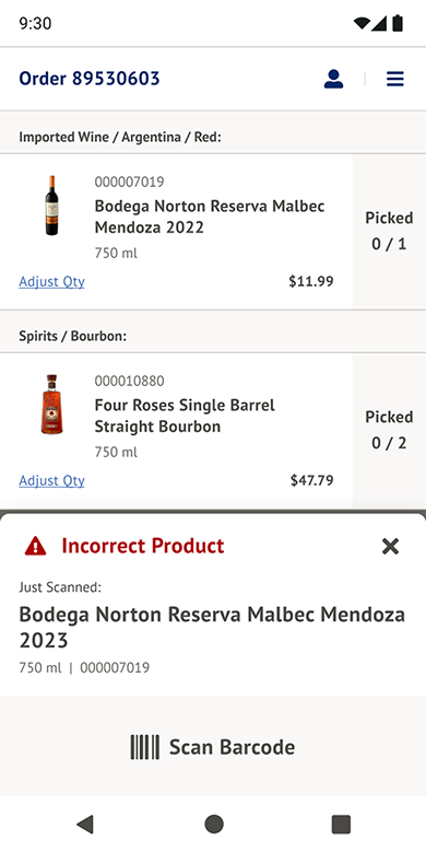
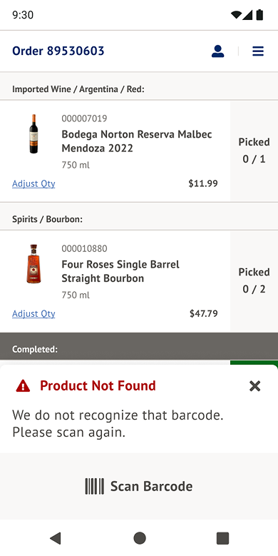
Incorrect product – the system flags when a scanned item doesn't match the order
Product not found – a clear, actionable message when a scan returns no match
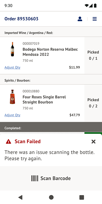
Generic scan failure fallback – handles edge cases where the scan attempt itself fails
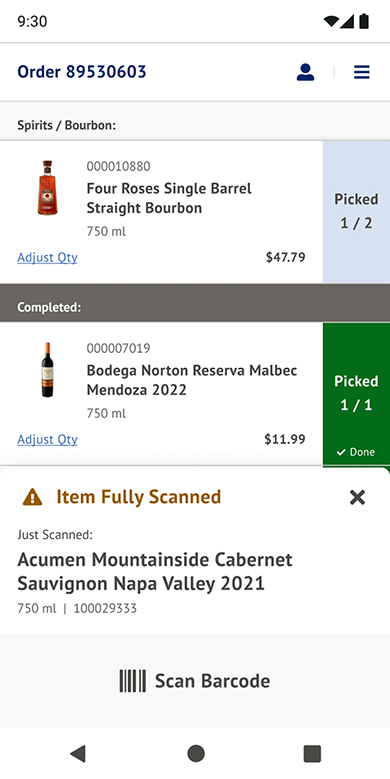
Max count reached – prevents over-picking by alerting associates an item has been fully scanned
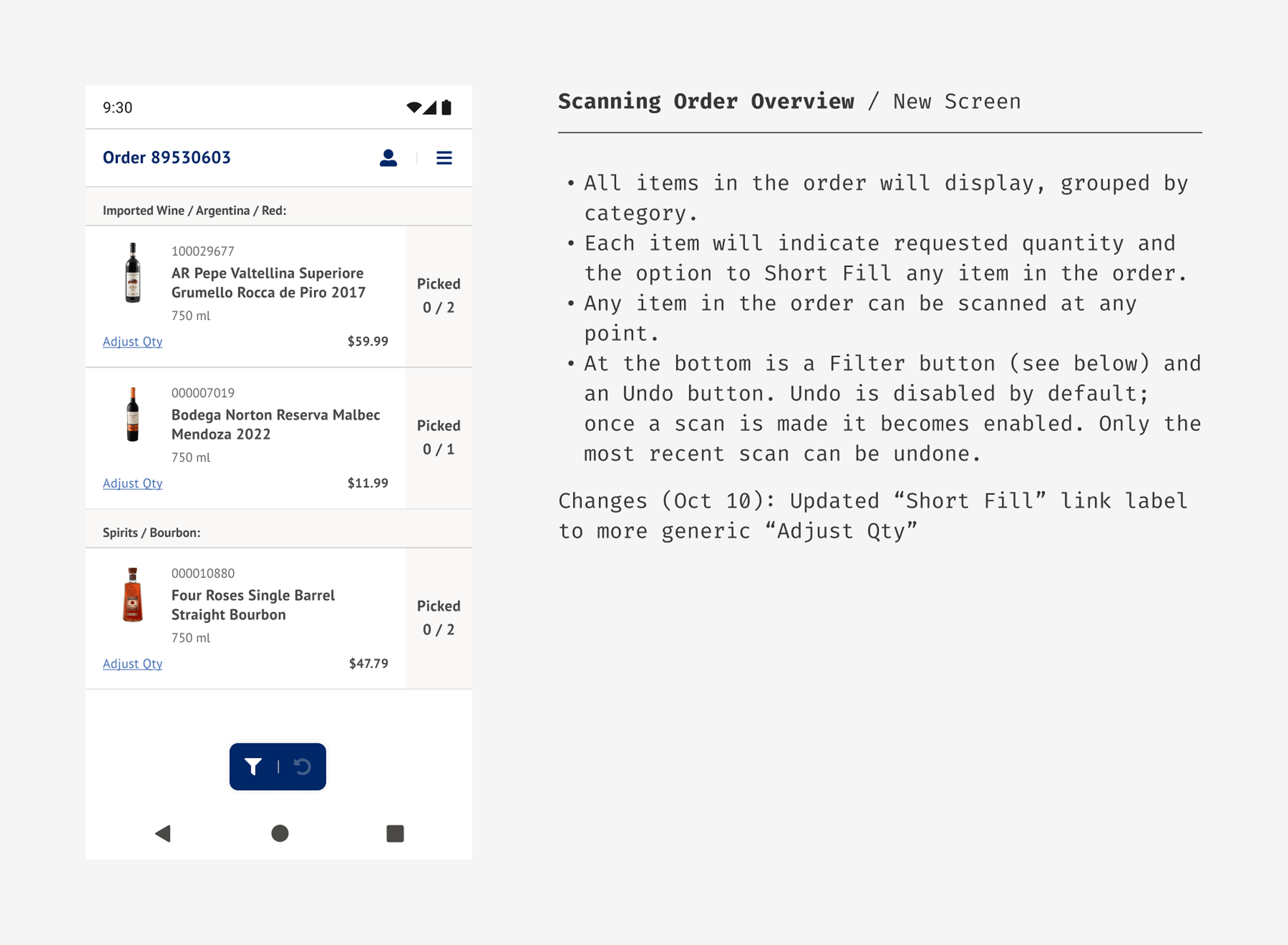
A sample of the functional specifications accompanying the designs – describing every state, edge case, and interaction for the development team.
The Outcome
After launch, the order error rate dropped to nearly zero. The combination of real-time item verification, clear error messaging, and auditory feedback eliminated the manual checking errors that had plagued the old process.
Associates adapted quickly. The client stakeholder feedback was direct and gratifying.
The new version of the portal is very intuitive for picking orders.
– PLCB Client Stakeholder
What I Learned
This project is one of the clearest examples of UX research directly driving outcomes. The observational study we did directly guided the design of the new tool.
We would not have understood the mental model associates were working with if we'd relied only on stakeholder interviews or requirements docs. Being in the store, watching someone pick an order with a printout in one hand and a product in the other, was invaluable.
The prototypes also proved their value. Showing the client a working simulation of the scanning flow gave them confidence and gave us early validation.